
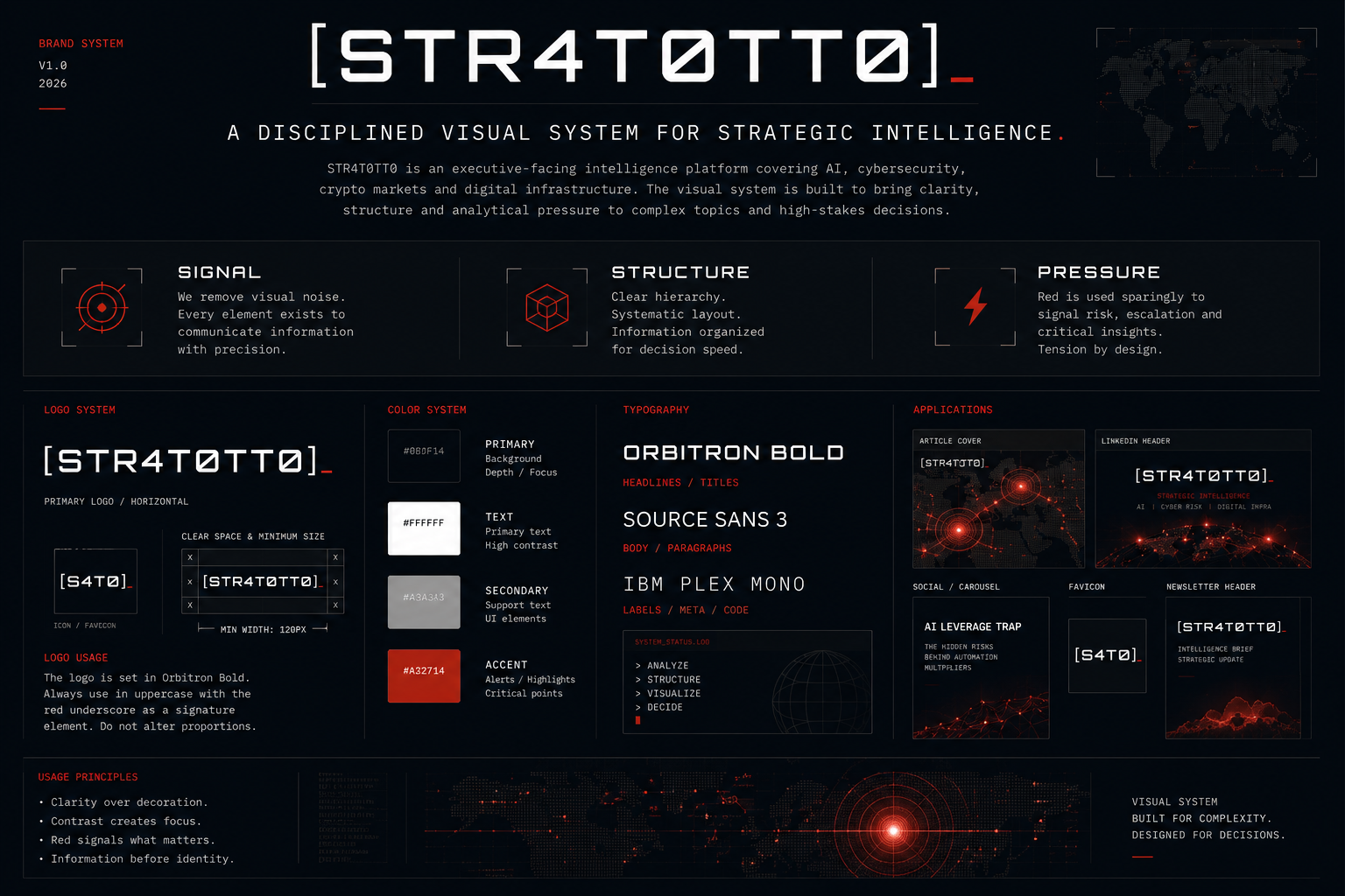
STR4T0TT0 was designed as a strategic information platform focused on artificial intelligence, cybersecurity, cryptocurrency markets, and digital infrastructure. The visual system was built to support executive-level analysis: restrained, high-contrast, and decision-oriented. Every visual element is intended to reinforce clarity, signal hierarchy, and exert analytical pressure rather than to serve decorative futurism.
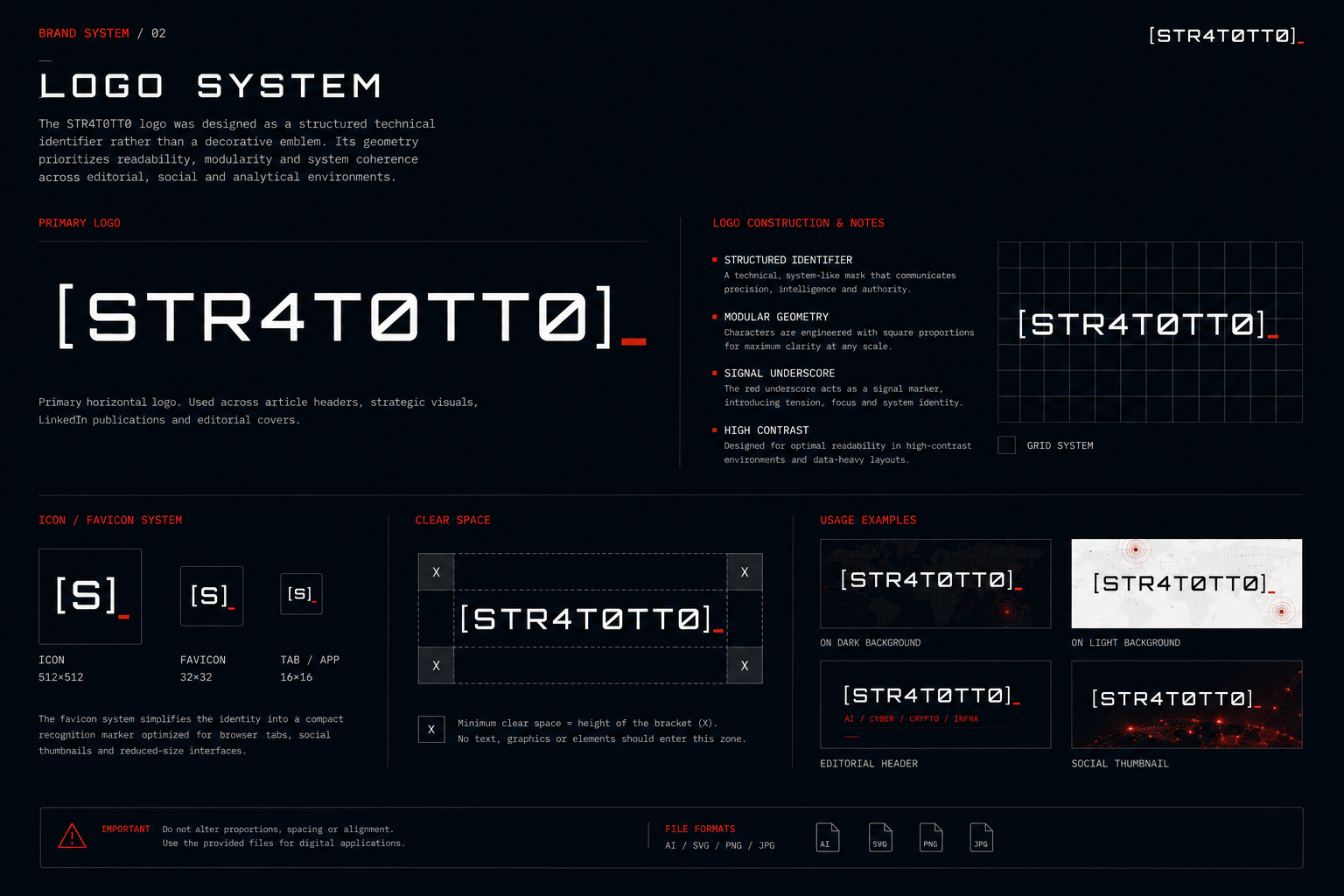
The STR4T0TT0 logo was designed as a structured technical identifier rather than a decorative emblem. The geometry prioritizes readability, modularity, and system coherence across editorial, social, and analytical environments. The red underscore acts as a restrained signal marker within the interface.
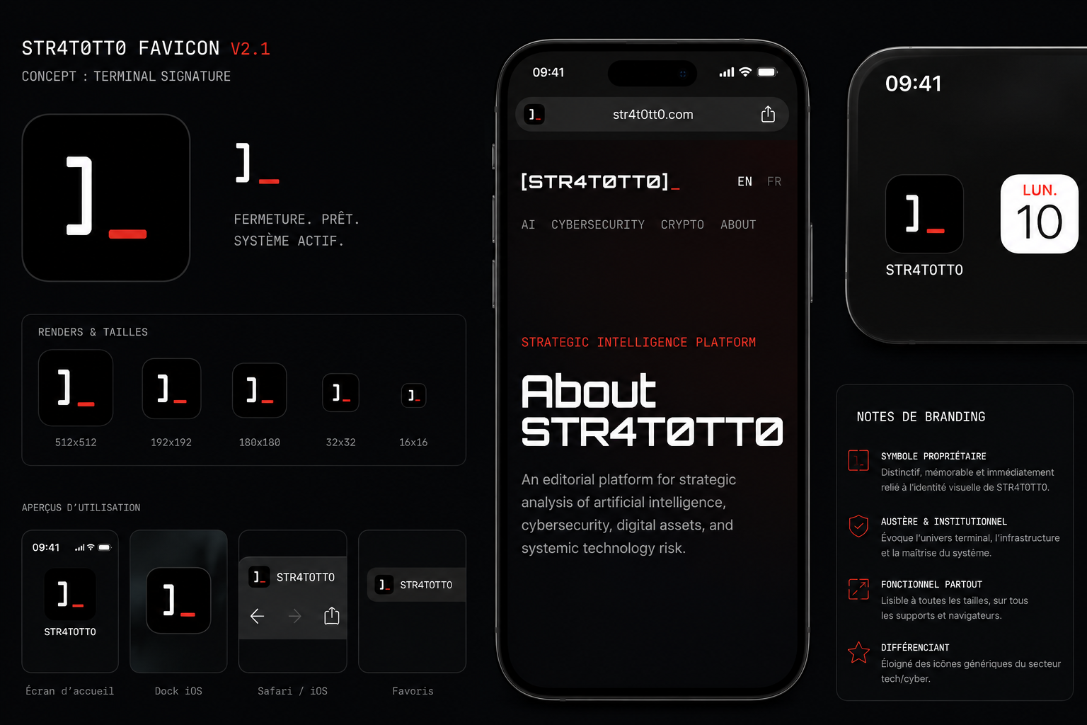
After analysis, I have decided to change the square version of the logo. The STR4T0TT0 favicon was designed as a compact terminal-style signature optimized for instant recognition across constrained digital environments. The new symbol preserves the structural tension of the primary identity while remaining highly legible at reduced sizes across browsers, mobile devices, and system interfaces.
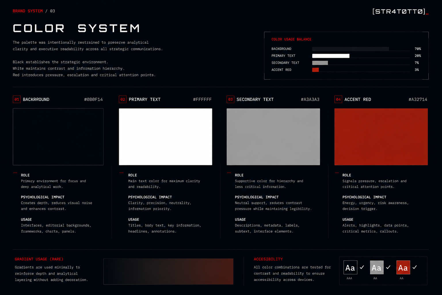
The STR4T0TT0 color system was intentionally restrained to preserve analytical clarity and executive readability across strategic communication environments. Black establishes the analytical space (depth / focus / analytical environment). White maintains contrast and information hierarchy (clarity / hierarchy / readability). Grey supports secondary interface elements without competing for attention (supportive information / interface balance). Red is reserved for escalation, pressure, and critical signal points (pressure / escalation / signal marker).
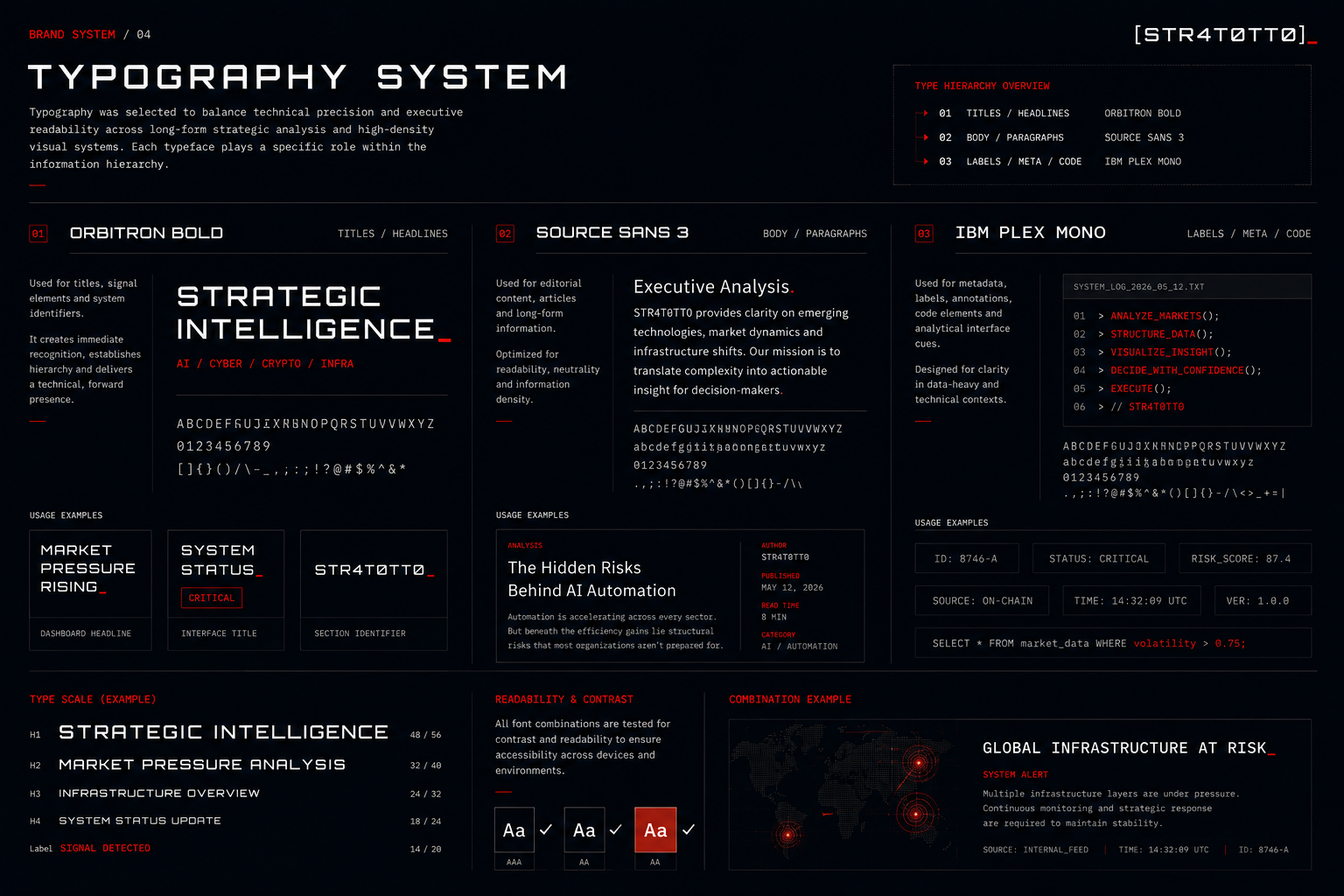
Typography was selected to balance technical precision and executive readability across long-form strategic analysis and high-density visual systems. The typography system was designed to preserve clarity under information density while maintaining a disciplined and coherent visual language across strategic publications. Each typeface plays a specific role within the information hierarchy: Orbitron Bold establishes signal presence and system identity (titles / headlines / signal elements). Source Sans 3 supports structured editorial readability (editorial readability / long-form analysis). and IBM Plex Mono reinforces metadata, analytical cues and interface annotations (metadata / labels / analytical interface cues).
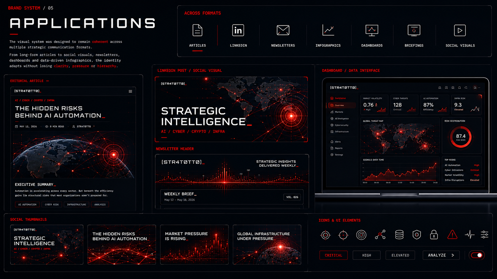
The STR4T0TT0 visual system was designed to remain coherent across multiple strategic communication formats.
From editorial articles to LinkedIn publications, newsletters, dashboards, and analytical infographics, the identity adapts without losing clarity, hierarchy, or signal discipline. Consistency across formats was prioritized to create immediate recognition while preserving executive readability under high information density.
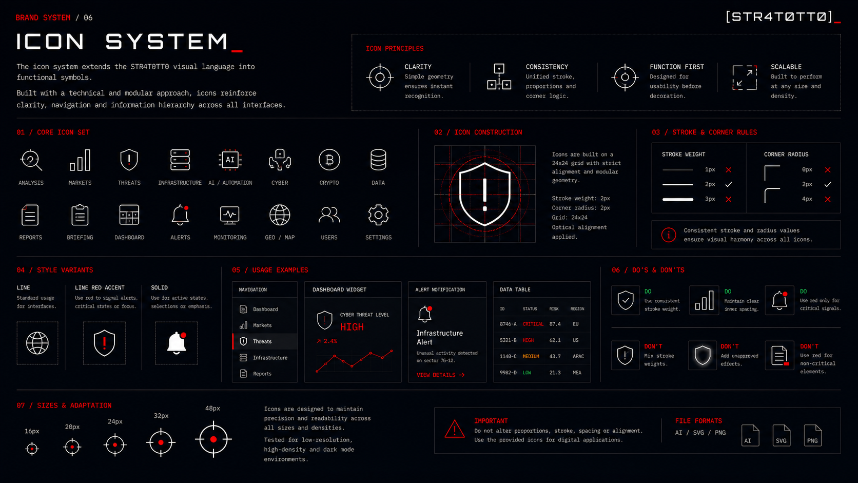
The STR4T0TT0 icon system extends the visual language into functional interface elements designed for clarity, hierarchy and fast recognition. Built with a modular and technical approach, the icons prioritize consistency, scalability and analytical readability across dashboards, editorial systems and strategic communication interfaces. Every icon was designed to remain legible under high information density while preserving coherence with the broader STR4T0TT0 visual system.
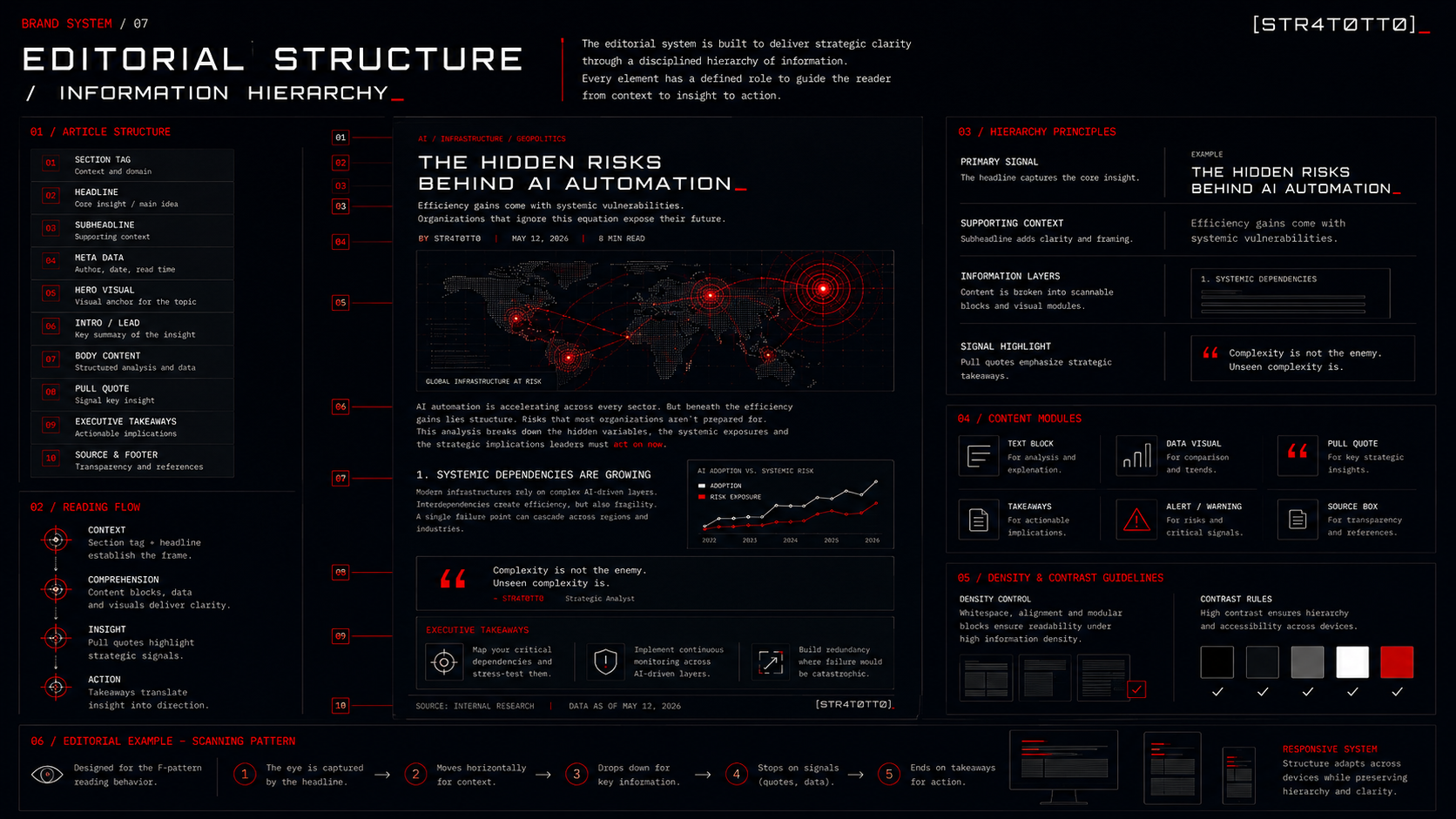
The STR4T0TT0 editorial system was designed to transform complex strategic subjects into structured and readable decision environments. Every layer of information has a defined role: titles establish the primary signal, supporting context frames the analysis, visual modules reduce cognitive friction, and executive takeaways translate insight into action.